Computer monitors.
That is how most atmospheric scientists see the subject of their careers.
Across countless monitors flash high resolution satellite images of entire continents,
data and maps just received from the latest computer model run, or maybe just
some point observations. Your hometown, maybe even the state you live in might
be represented by a single station model on a map or a handful of pixels on a
satellite image. We atmospheric scientists sometimes have the rather unbecoming
tendency to see weather at a large scale. Most of the time, weather appears as
charts depicting the smoothed out distribution of parameters such as pressure
or temperature. Even our computer models lead to disconnect; their resolution
might be on the order of twenty or thirty miles, sometimes even more. All this
can lead to the desensitization of what is actually happening on the ground. It
can be all too easy to forget that below the anvils of supercells in an
impressive squall line, there might be a tornado tearing through someone's
house, or hail destroying a season's worth of crops. Tropical cyclones are even
worse. Who could not marvel at a perfectly shaped spiral of brilliant white
clouds spinning its way across the ocean? This is all perfectly fine when the
cyclone is over open water, but what about when it makes landfall? Is the first
thing that comes to mind that densely populated city on the coast in a country
where people can't always afford the sturdiest of dwellings? A lot of people,
including atmospheric scientists probably won't. This does not mean they're bad
people; it’s just an unfortunate tendency of human behavior. On the other hand,
those who study these various spectacles of weather should try to keep those
affected firmly in mind. I myself am guilty of this sort of detached perspective;
I might be mentally cheering on a storm, hoping to see it break some record, or
become overly excited when I correctly forecast a storm. What it all boils down
to is a reminder that when viewing a forecast made by a supercomputer or an
image straight from the heavens, there are those beneath the clouds that might
have a very different perspective on the weather.
2012/10/28
2012/10/22
Big Time Weather...For Washington
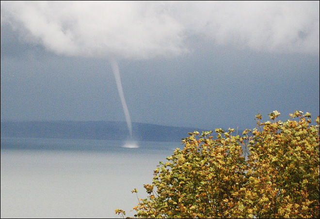
Last Saturday (Oct 20) from about 4:00 pm to 4:10pm, the residents of
western Washington were treated to a surprise: a waterspout. It occurred just
off the shore of Everett, which is about 25 miles north of Seattle. One little
waterspout is nothing to write home about across most of the United States, but
in western Washington, where even a single stroke of lightning is a big deal,
such an event makes breaking news. I decided to investigate the funnel cloud
more closely, so I downloaded raw radar data from KATX, a weather radar located
on Camano Island about 15 miles to the northwest, which is actually really
close. Besides the normal reflectivity data, which is what if often shown on
TV, I also looked into the radial velocity data. This kind of data shows the
speed of the rain coming towards or away from the radar. What makes this so
useful is that rotation in the cloud can be spotted since one side of the
rotation will be moving towards the radar very fast, and the other side will be
moving away very fast. Since the rotation is small one just needs to find a few
pixels in the data that are very different, yet very close together. Typically,
the radar will not see the actual funnel cloud, whether it be a tornado or a
waterspout, since the radar's beam will be well above the cloud base at the
distance the storm is at. Despite this, with KATX so close, I thought I might
give something a try...
-All of the following photographs were taken by others, but unfortunately I do not have the sources. If these images belong to you, I mean no disrespect.
-All of the radar images were made by me using Unidata's IDV program with Level II NEXRAD data. Note that all my images are from a 4:08pm radar scan.
Here, the spout is roughly south of
the observer, who apparently is in a downpour.
This image is probably at about the
same time as the previous one, but looking basically north. It is likely the
photographer of the last image was located on the piece of land behind the
funnel in this picture.
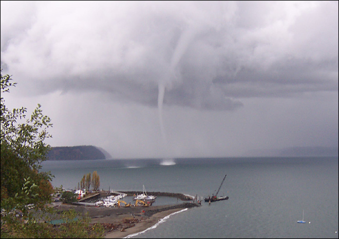
This is the best one. Notice how the
funnel can be seen extending up through the lowest level of clouds. Also, to
the left of the waterspout appears to be another one forming, as evidenced by
the disturbed water.
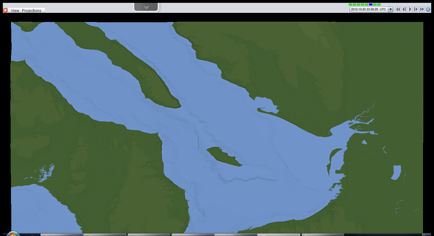
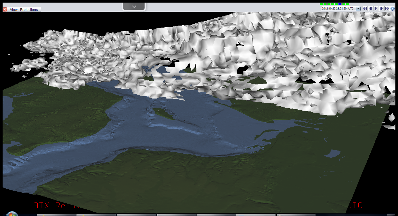
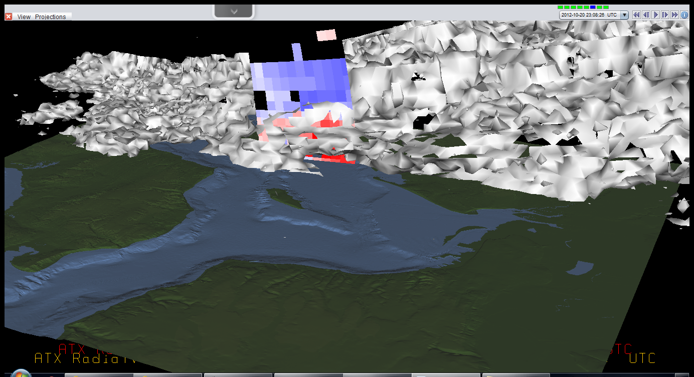
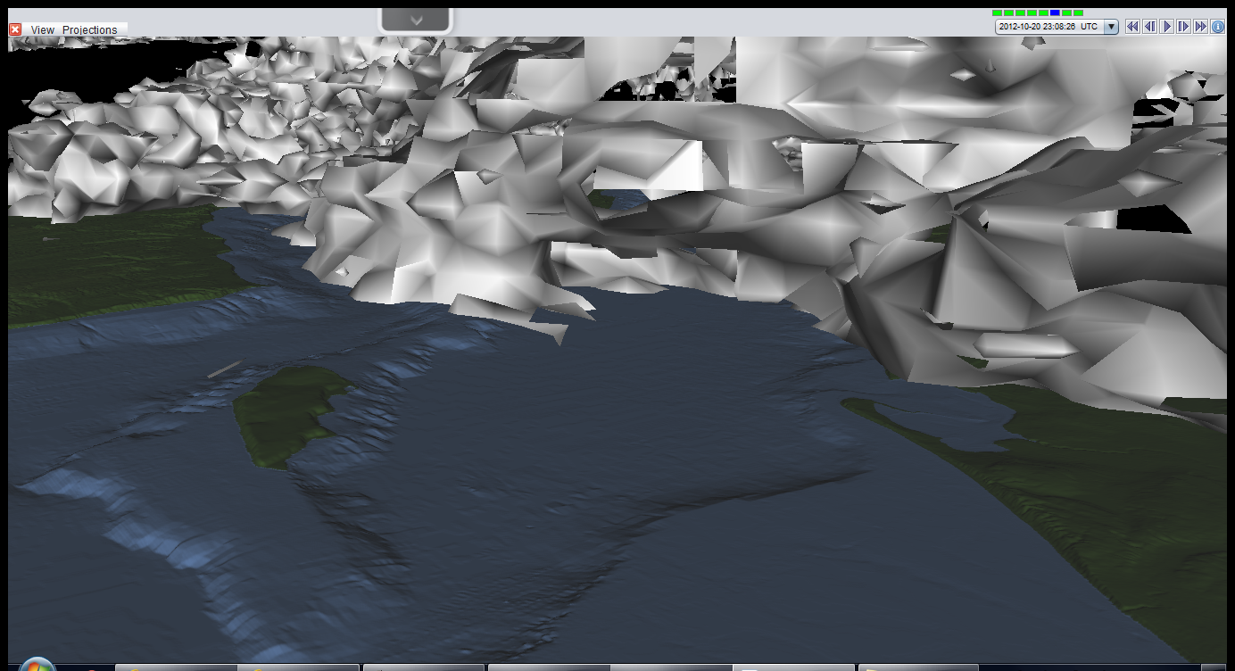
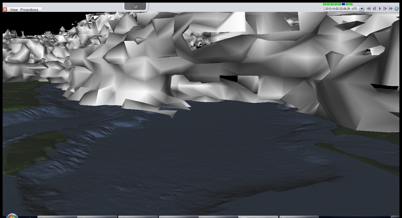
This is the topography map I used for
my images. The KATX radar is located just off the top left corner of the image
and Everett is located on the center right.
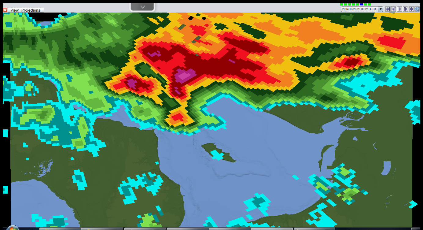
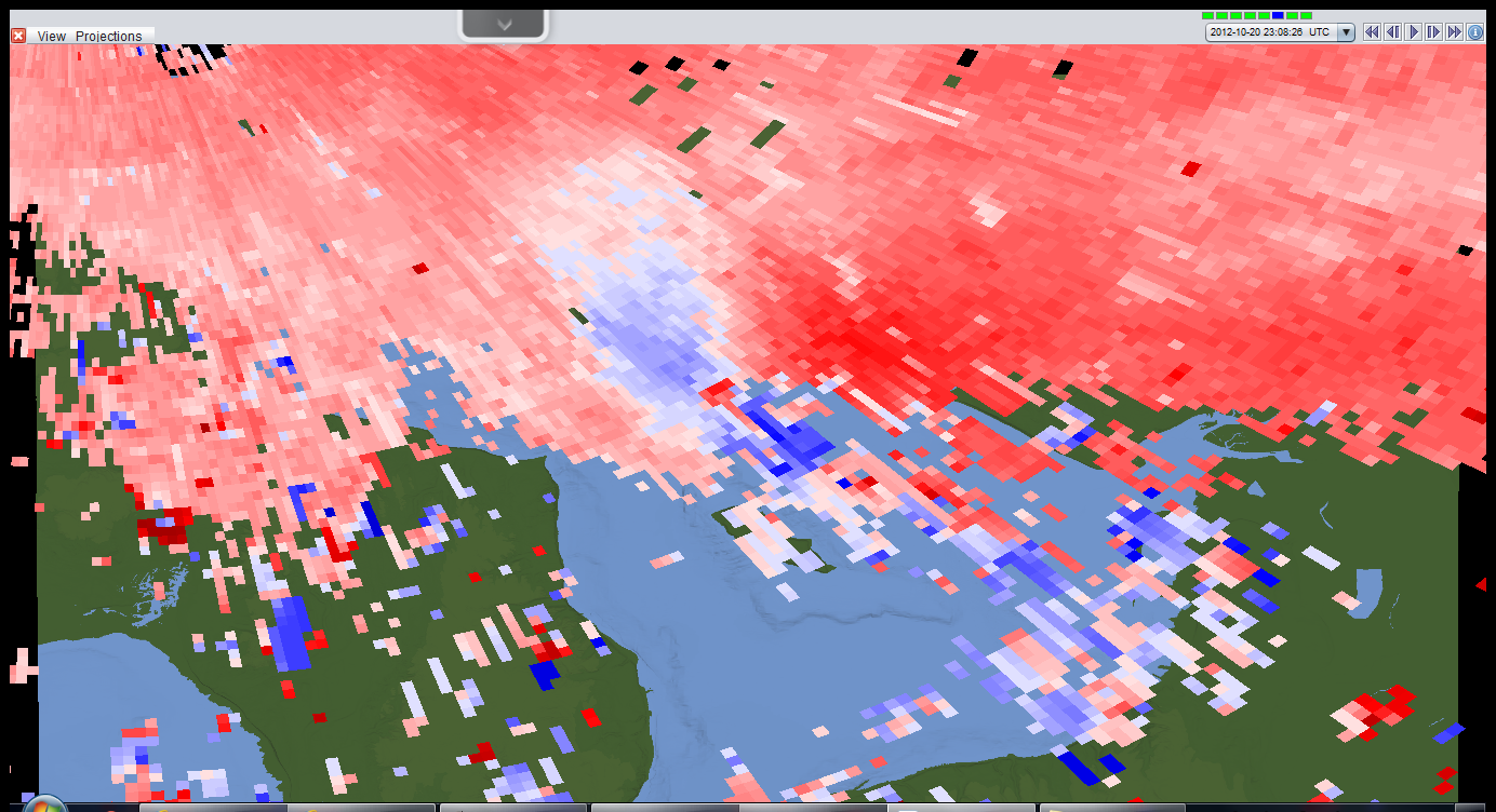
Here is the reflectivity data, like
what is often shown on the news. Notice the hook in the clouds just north of
the island, that is the general region I suspect the waterspout was.
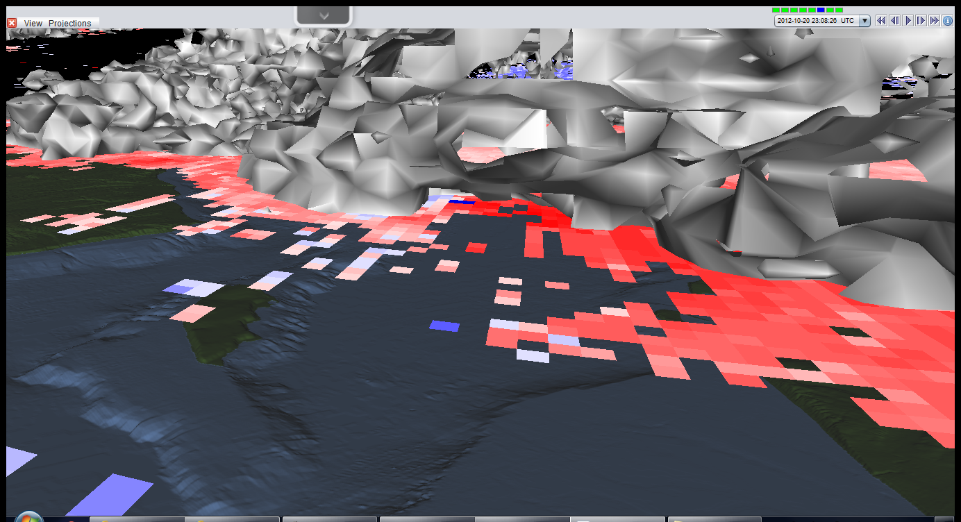
Next is the radial velocity data from
the same radar scan with the same field of view. Near the center of the image
are some very boldly colored pixels, but some are red and some are blue. This
is likely a sign of concentrated rotation.
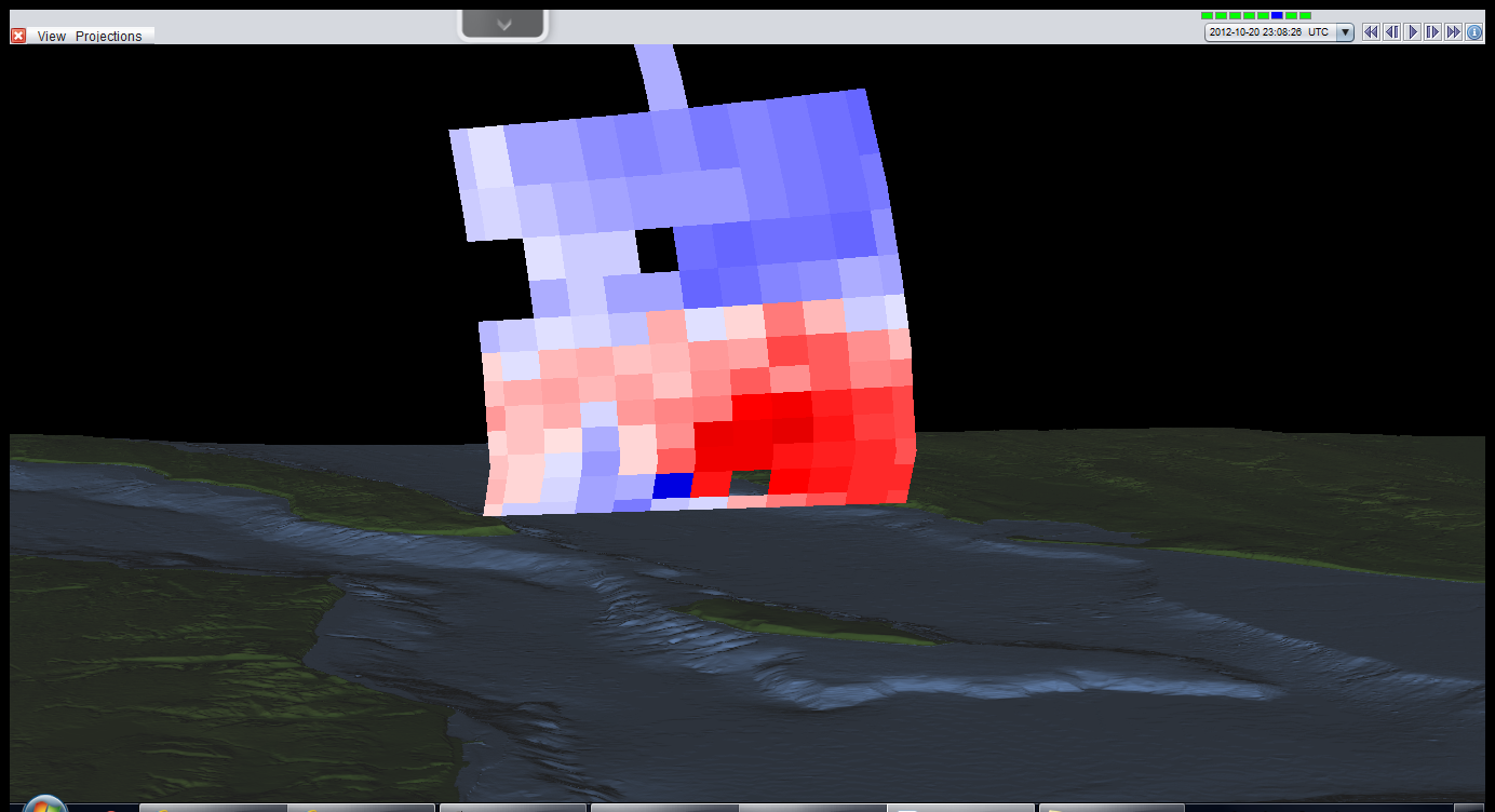
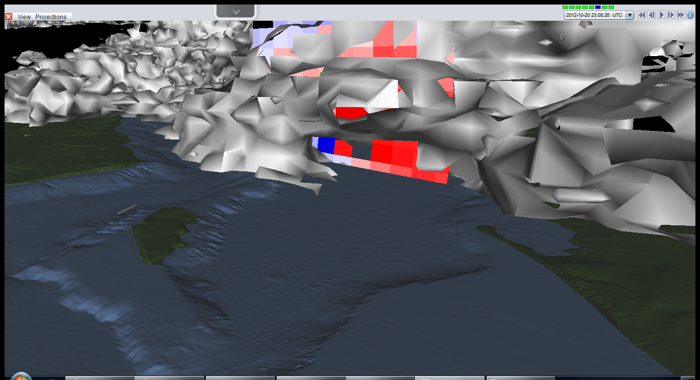
Using the same data as the last
image, I constructed a cross-section right though those bold pixels. Even in
the vertical, there is some bold blue right next to bold red. I might really be
on to something...
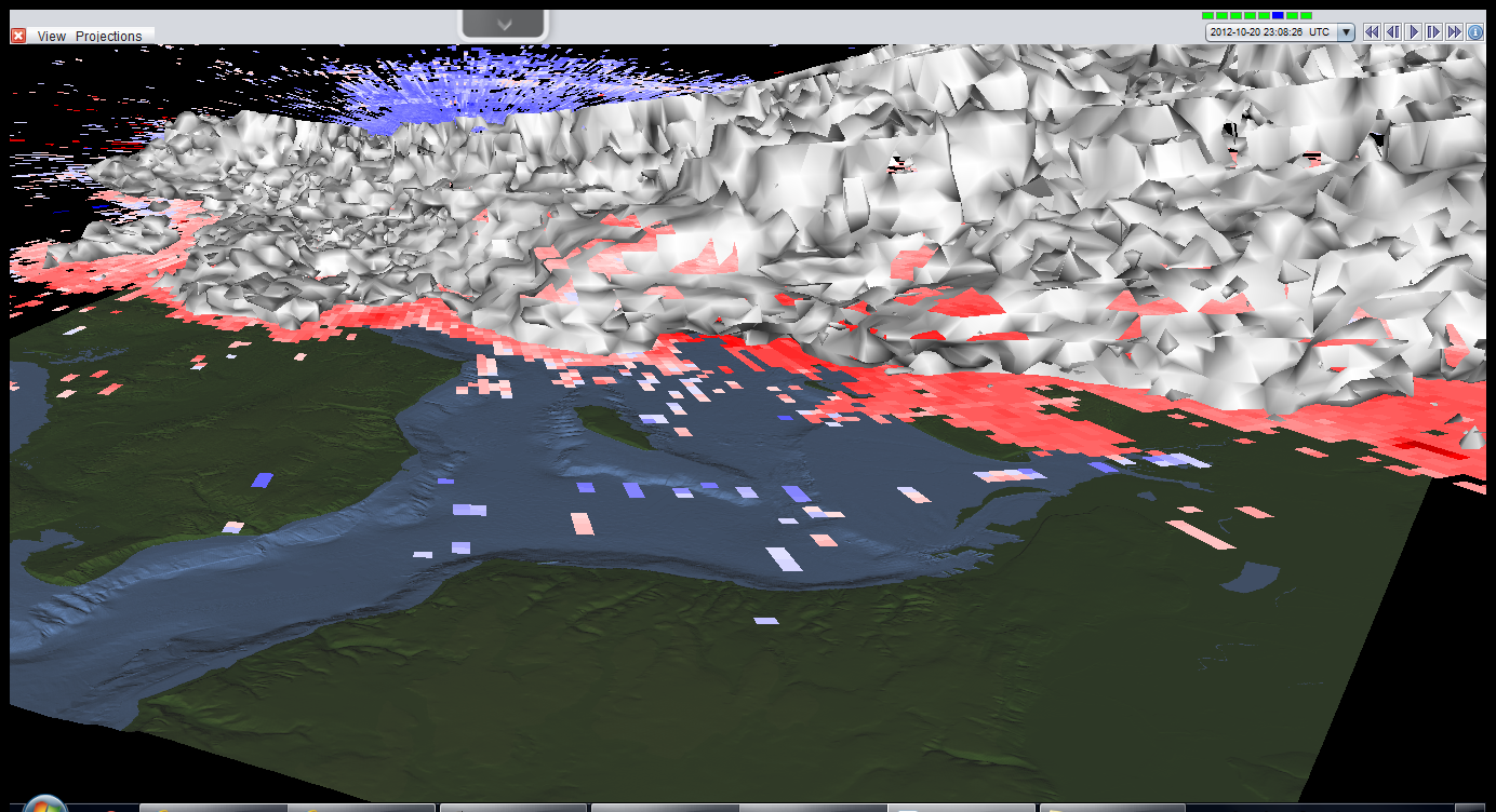
So now I get a little tricky. The
tangled white mess is called an isosurface. This means that everywhere on the
surface some parameter has the same value. In this case, everywhere on the
white surface, the radar measured the same reflectivity value. This somewhat
shows the distribution of clouds.
Now I've turned that velocity data
back on. If you look closely, there is a little hollow area near the center. In
that area are those bold pixels.
Now the cross-section has been turned
back on. Once again, those bold pixels are located in that little cavity.
This is the same series of data as
the previous three images, just zoomed in more.
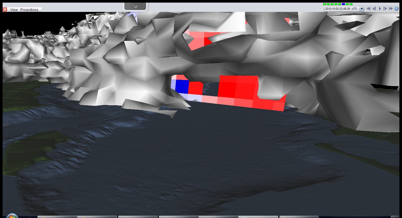
Now it’s really zoomed in. It is very
clear something is going on in here. And look at little speck at the
bottom of the data, just below the bold red pixel, interesting.
Ta da! With the cross-section off, it
is clear that the little speck is really some pointed feature right in the
middle of the cavity. That, I believe, is the radar signature of the waterspout
itself. All of this even agrees with the actual photos. Remember the heavy rain
from the first one? That would be the wall of white in the back of the cavity.
Furthermore, it was nearly sunny in the second picture, which matches the radar
image, where no rain is detected south of the cavity.
Wow, I never expected to find data this
good. I'm glad I checked.
2012/10/16
Storms of the World
Wow...
For past few days the tropics have just been exploding with activity. In the Atlantic is Hurricane Rafael, in the NEPac was Major Hurricane Paul, in the NWpac is Typhoon Prapiroon and Tropical Storm Maria, along with Invest 91W, and in the South Indian was Cyclone Anais. Below is an image from multiple geostationary satellites from 10/15/12 at 18Z with each of these storms labeled.

All this activity is enough to start affecting the mid-latitudes. Below is an animated loop of total precipitable water (TPW) stitched together from multiple microwave satellite swaths over 72 hours (ending at 10/17/12 00Z), produced by the Cooperative Institute for Meteorological Satellite Studies (CIMSS) at the University of Wisconsin-Madison. This essentially show how much precipitation would occur if all the water that could precipitate in that air actually did. Its great for tracking air masses across large distances and it helps one find the source of pockets of moisture. In the loop below, moisture from the outflows of both Prapiroon and Maria get swept up in strong westerlies. This moisture made its way all the way to the Pacific NW of the US where it dumped (and continues to dump) large amounts of rain, abruptly ending a nearly record-breaking dry streak.

2012/10/14
101: Maps II
Upper air
maps


Last time I went into detail about
sfc weather maps and how to read them, I also mentioned there were two types of
maps: sfc maps and upper air maps. Now it’s time to do that second one.
When meteorologists talk about upper
air, they’re referring to pretty much everything that is not at the sfc (or
very close to it). To identify how high some upper air phenomena is pressure
(in units of millibars, mb) is often used instead of elevation, such as feet or
meters above ground. What this all means is that the height of any given item
is expressed as the air pressure at the level of the item, for reference, the
average pressure at sea level is 1013mb. Pressure itself decreases with height,
so the lower the pressure, the higher the item is. However, pressure does not
decrease linearly with height as the figure below illustrates, instead is a
curve. Furthermore, the height of any given pressure level will vary from place
to place due to weather systems. For example, the altitude that the 850mb level
can be found at is in the neighborhood of 1460m above sea level, but in the
middle of a low pressure system 850mb might be observed at less than 1200m or
in a high pressure system it may be found at over 1600m. Therefore, if one were
to drape a giant blanket over the Earth such that the blanket was always at the
altitude where some given pressure was found, it would appear as a bumpy surface
with depressions, mounds, and wrinkles.

To plot upper air maps, this pressure
concept is basically turned inside out; the map lies on a single pressure
level, and the contours on it reflect the altitude at which the pressure value
is occurring. These lines of altitude (often referred to as height contours)
are plotted in the same way isobars were plotted on the sfc maps. Why is this
somewhat confusing convention used? Many important and fundamental equations
and concepts in atmospheric science work out much better is height units are
expressed with pressure. Another reason is that it helps visualize how air is
moving, since low pressure systems will have lower height values; one can imagine
objects sliding down into them like water does in a funnel. The same goes for
high pressure centers, because they have the highest height values in a given
area, it is as if air flows down them like water flows down a hill. Overall,
the height contours on an upper level map will have a very similar pattern to
the isobars on a sfc map.
When looking at an upper air map,
perhaps the most noticeable difference from sfc maps is that they have far
fewer features. In fact, fronts are not generally plotted on upper air maps at
all, because the sharp temperature gradient that defines a front pretty much disappears
by around the 700mb level. Below are the features that do appear on upper air
maps:
-Height
Contours (Isohypse)
These are the contours discussed
above. At lower levels, these will look much like the sfc isobars, at higher
levels height contours tend to become smoother with far fewer closed contours.
-Temperature
(Isotherms)
Isotherms are lines of constant
temperature, plotted in much the same way isobars or height contours are
plotted. They are generally depicted as dashed lines and are labeled in units
of degrees Celsius.
-Observations
Upper air observations are obtained
from weather balloon data, also called a radiosonde. On the maps, this data is
displayed on a station model similar to the ones found on sfc maps. However,
these are much simpler and typically include just wind data, temperature, dew
point, and height. There are also far fewer observations since very few
stations launch radiosondes compared to the total number of weather stations,
and they are launched just twice a day (at 00Z and 12Z).
-Wind Speed
(Isotachs)
For the higher upper air maps, such
as the 300mb and 200mb level maps which occur near the level of the jet stream,
lines of constant wind speed are plotted. These are plotted in the same manner
as isobars and isotherms and are typically labeled in units of knots. Regions
of particularly high wind speeds may be shaded, helping to identify the
location of the strongest parts of the jet stream, called jet streaks.
Below are a series
of images from the same time as the images in the post on sfc maps. Several
levels are shown, and some are overlaid on satellite imagery. Finally, I
included one of the sfc maps from the sfc map post in order to compare it to
the upper level maps.


2012/10/12
Happy New Year!*
*Well, at least it is the beginning of the year for the southern hemisphere. Tropical Cyclone ONE in the SInd basin becomes the first storm of the 2013 southern hemisphere season with an initial intensity of 35kts. The disturbance has been out there for several days now, then yesterday it began to rapidly organize. It is not fore casted to reach hurricane strength (65kts) as now, but experience has shown me that intensity forecasts are subject to significant change. Only thing left to do is get out the streamers and the firecrackers; the southern hemisphere on!
(sadly, the right images are not available to make a summary for this storm yet, blame EUMETSAT)


(sadly, the right images are not available to make a summary for this storm yet, blame EUMETSAT)


2012/10/11
101: Maps
Now that
I’ve handled the vertical, it is time to cover the horizontal: Maps!
There are
two main types of weather maps, surface analysis maps and upper level maps
(which I will get to later). More than likely, everyone has seen a surface
analysis (I tend to abbreviate surface as sfc) even if they don’t realize it. These
maps display the weather on the ground, hence ‘surface’ map, and are commonly
seen on TV weather reports or in the daily newspaper. The official variety of
these maps follows a specific structure that stays pretty much the same all
across the world. While the exact look and feel of the maps may differ, there
are some pieces of data that you can almost be sure to see.
-Isobaric
Analysis
The most common feature on sfc maps are isobars, or lines of
constant sfc pressure. These contours denote the pressure found at that
location in units of millibars (mb, which are equal to the metric unit hectopascals,
hPa); however, these values are often abbreviated for clarity by shortening the
value to two digits. Therefore, 972.8mb becomes 73, 999.0mb becomes 99, and
1002.4mb becomes 02. It should be noted that the pressure being used here is
sea level pressure, therefore the pressure represented with isobars is what the
pressure at that location would be if it was located sea at sea level. The
process of converting the pressure is called reduction to sea level and
requires a hardy equation and several assumptions, so pressure values from stations
at high elevations have a tendency to be off a tad. The pressure between any
two contours will be somewhere between the values. The placement of each line
is determined by the observed pressure of hundreds of ground locations that
report the current weather at their site regularly, so drawing isobars is kind
of like playing connect the dots, except most dots will fall between lines. For
example, say the sfc pressure in NY City is measured to be 1010.3mb and the
pressure in Chicago is measured to be 1007.7mb. The 08 line, that is the line
at which the pressure is 1008mb, would lie somewhere between the two cities. It
is important to remember that since isobars are lines of constant pressure,
they will never merge or cross each other. Furthermore, most maps will have
pressure lines drawn at 4mb intervals, centered on 1000mb. On any given map,
there will be places where the sfc pressure is lower than at any adjacent
location, or the pressure will be higher than at all adjacent locations. These
points are low pressure centers and high pressure centers, respectively. Each
center will likely be surrounded by loops of closed contours, the more closed
loops there are, the more intense the low, or high, is.
-Frontal
Analysis
Along with the lines of constant
pressure are often lines marking where abrupt pressure change is occurring.
These lines are called troughs, fronts, dry lines, and ridges.
-A trough is a line of minimum pressure. On a sfc map,
troughs appear as regions where isobars circling a low bulge outward and are
denoted by dashed lines.
-One special type of trough are fronts, which follow the same
basic definition as troughs, but also represent a region of sharp temperature
gradient. Four types of fronts exist: warm fronts, cold fronts, occluded
fronts, and stationary fronts. As a warm front passes, one can expect the
temperature to warm because the air behind a warm front is typically coming
from far south. A cold front is just the opposite, with cold air from up north
trailing behind it. Cold fronts are usually much more abrupt and typically far
easier to find using isobars. Occluded fronts are generally found near the core
of mature low pressure systems and are the result of a warm or cold front
catching up to the other and merging, creating an almost zipper like
appearance. Finally, stationary fronts have a structure similar to cold fronts,
except there is little or no motion of the front, that is, the cold air is not
advancing southward. When surface maps are in color, cold fronts will appear as
blue lines with triangles pointed in the direction the front is moving. Warm
fronts will be in red with bumps pointed in the direction of motion; occluded
fronts will be purple lines with alternating triangles and bumps facing the
same direction. Stationary fronts will alternate between short blue lines with
a triangle and short red lines with a bump, with the triangle facing into the
warm air and the bump facing into the cold air. Fronts are a very important
part of sfc maps, yet they can be hard to plot correctly, so it would be wise
to not solely rely on them.
-Dry lines are a feature generally found only in the central
U.S. and maybe south central Canada. They are similar to fronts, except instead
of being a region of strong temperature gradient, they are regions of strong
dew point gradient, essentially means a strong gradient in moisture. On the
east side of a dry line is air that is near the ground and flowing north from
the Gulf of Mexico. On the west side is very dry air that is flowing eastward
from over the Rockies and the high desert in northern Mexico. Since the terrain
slopes upward as you go from east to west, the dry air will end up riding on
top of the low lying moist air. Where the land intersects this boundary is the dry
line. Dry lines are often associated with severe weather on the planes so
they’re an important feature to look out for. They are drawn as orange lines
with closely spaced small open bumps, however occasionally a sfc map will not
use this convention and simply mark it as a trough, so in that case, look to
either side of the trough, if observations indicate a big difference in dew
point on opposing sides, it’s probably a dry line.
-Last are ridges. These feature share a lot with troughs as
far as their appearance on sfc maps, but they are regions of high pressure.
High pressure systems are usually not as sharply defined as lows, thus ridges
are often quite vague. In fact, ridges are often omitted completely from maps,
but when they’re not, they are denoted by a zigzag line.
-Surface Observations
Observations from weather stations
on the ground (or on ships or buoys) are the raw data from which isobars and
fronts are determined. The format for each set of data is called the station
model. It is a lot easier to see one than to try to describe it in words, so
the picture below should help.

Note that the present weather and total sky
cover entries have lots of possibilities, below are a few other images with
some examples.


-Notes
Occasionally additional text notes
will be added to the map in order to inform the reader of some significant
weather or hazard. For example, tropical cyclones have text boxes associated
with them that gives a short summary of the storm. There might also be text
indicating a developing storm or high winds.
Below are
some maps from a few days ago. They are all from the same time, but of slightly
different formats. Also included are an array of satellite images and a radar
composite, also from the same time, to show how features on the map correlate
to features on imagery. Lastly, I’ve drawn some annotations to point out some
of the key features.


(I'll post these images at higher resolution in the Gallery for those who are interested)
2012/10/06
101: The Atmosphere
As seasons
begin to change, so does the weather. Discussion of this weather often uses
much more “science talk” than what I’ve covered so far. Therefore, I’ll be
making some informational posts along the way (such as this one) to make sure
things stay clear. Each of these posts will be part of what I’m calling the “101
series”, so the title of each post of this type will begin with “101”.
THE
ATMOSPHERE
Perhaps the
best way to begin is with the largest scale. Many of the terms used here are used
so frequently by atmospheric scientists that it can be easy to forget that
others might not have clue as to what they are talking about. I plan on alleviating
that issue, so without further ado, here is The Atmosphere.
The
atmosphere is divided up in to several layers; the exact number varies slightly
depending on the source. At the top of each layer is a boundary called a pause (essentially meaning “the limit of”).
Each layer of the atmosphere is more-or-less defined by its temperature
profile, that is, how temperature changes with height, also known as the lapse
rate. The character of the lapse rate often results in. or results from, other
defining characteristics which are quite important. To begin this journey through
the atmosphere, let’s start at the bottom:
-The
Troposphere
This layer is home to the weather.
Virtually all the clouds you see in the sky are contained in this one, relatively
thin layer of the atmosphere. At the very bottom of layer, adjacent to earth’s
surface, is the Planetary Boundary Layer (PBL). The air in the PBL is strongly
influenced by the drag on the air caused by friction with the ground, which
causes the air to be well mixed and rather chaotic. For example, it is because
of this chaos that wind gusts occur. The rest of the troposphere is, for the
most part, poorly mixed, relatively speaking. In the troposphere temperature
generally decreases with height, it is because of this property that pockets of
air may rise (being warmer than their environment) which leads to clouds and
ultimately helps produce the weather. At the top of the troposphere is the
tropopause, which is where the temperature profile suddenly begins warming with
height, preventing air pockets to rise past this point, which is why virtually
all clouds exist in the troposphere. The height of the tropopause varies widely
but generally decreases from about 17km in the tropics to around 11km near the
poles.
-The
Stratosphere
As the name suggests, this layer is
highly stratified, meaning there is almost no mixing in this layer thanks to
the increasing temperature with height profile. The jet streams that direct
weather in the troposphere often exist at the very bottom of this layer. Higher
up is the ozone layer, which is by far the most defining feature of the
stratosphere. Ozone is highly important because it absorbs ultraviolet
radiation that is deadly to life on the surface. In absorbing the radiation,
ozone molecules dissociate and emit some heat in the process. It is this heat
that is responsible for the layer’s temperature profile.
-The
Mesosphere
The “middle” layer of the atmosphere
is also the coldest. The temperature profile here decreases rapidly from its
peak at the stratopause, reaching a minimum of nearly -100 degrees Celsius
(-135 Fahrenheit) at the mesopause. It is in this layer that most meteors burn
up, or at least begin to burn up, since above the mesosphere the air is just
too thin to produce much friction. Due to its high altitude, from roughly 50km
to 80km above the surface, not much is known about the mesosphere as it is too
high for planes to reach, yet too low for satellites to orbit in. It is for
this reason that this layer is sometimes called the “ignore-o-sphere”.
-The
Thermosphere
By the mesopause the air has become
very thin and is virtually unprotected from intense ultraviolet and x-ray solar
radiation. This bombardment breaks apart molecules and strips atoms of
electrons, creating a highly ionized environment. These processes produce a lot
of heat causing the temperature profile to increase significantly with height,
however because the air is so thin, you would likely freeze almost instantly in
what is essentially outer space. In fact, many satellites orbit within the
upper part of the thermosphere.
From there
the atmosphere fades into the void of space. Some sources call this the
exosphere, but it basically doesn’t have any effect on weather down near the
surface. Below is a diagram from NOAA depicting these layers and the
temperature profile.

TC Summary: note that there is also INVEST 90S in the south Indian ocean, but does not have great satellite coverage right now.


Subscribe to:
Comments (Atom)